Please take a look at this image.
Take your time and critique it (to yourself for now).
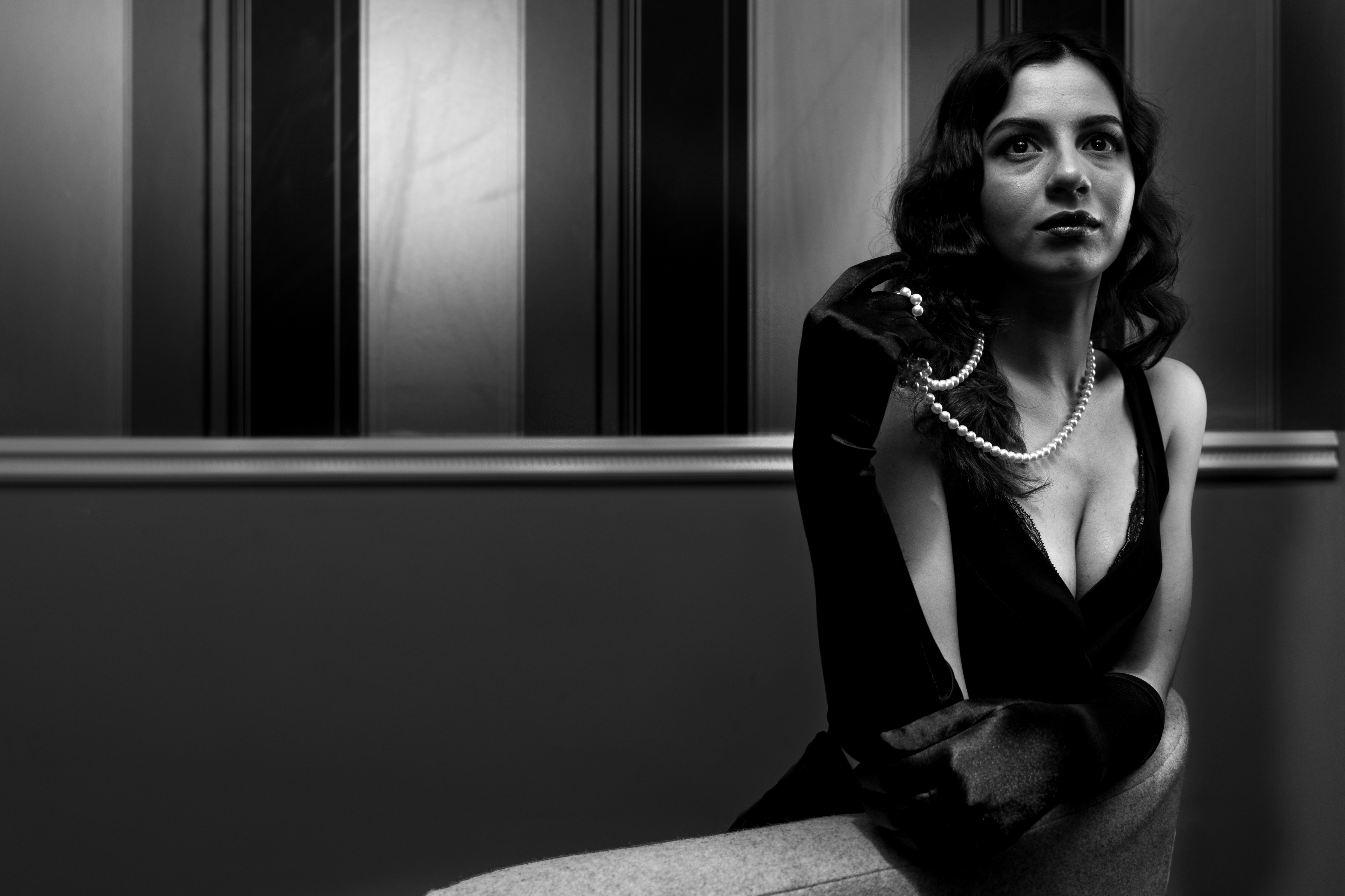
This is one of my rejected images that I wrote up for my city & guilds submissions.
If you have finished having a look at the photograph I will tell you why I rejected the image………
Firstly I will say that when I first looked at this image on my computer I loved it. I felt I had caught a really nice portrait and I was really pleased. Actually I was chuffed!
- The model is slightly off when using the rule of thirds. That was intentional but as other images were not slightly offset, would the examiner really know the intent of the composition. Probably not.
If I had three or four images slightly offset this would show intent and the composition would be perfectly acceptable.
Naturally rules are there to be broken. However, not when I don’t want little things to distract from the image and my grades.
- The wall paper has damage or creases.
Obviously this is something that can be easily rectified.
- The chair rail is not totally straight.
To be fair I could live with that and again, it is an easy fix.
- Some loss of detail in the black areas but hey, its supposed to be in the mood of film noir so thats okay and not really a problem.
- The image was taken in landscape view and not in portrait view.
Well, every image was shot in landscape to show intent.
Many were also shot around the 30-40mm range. Again to show intent.
Unfortunately only once the image was printed did I notice the false perspective of the models left hand.
That was the point that I felt the image had to be discarded from the final selection.
I suspect you spotted all of those and perhaps one or two or three or more others.
I like the light, the depth of field, the composition, the catch light in my models eyes; generally speaking I like the pose and her playing with the pearls but I kept seeing the hand and feeling negative about the image.
Please feel free to take another look and critique it openly this time (constructive comments are always welcome).
You could also head over to my flickr page to see more images.
Thanks for visiting.
Jim Jimmy James


Jimmy, I am hesitant to criticise, as it should all be about the intention of the photographer. I viewed it expanded, and there is no problem at all with the model.I found the background a little distracting though. Have you tried this shot in 1:1, cropped for the model? Might have more impact. Otherwise, I would have no real issues, other than that is fora C&G pass.
Best wishes, Pete.
I had much stronger images to submit & I did okay with the C&G. 🙂
Good news mate. Well done!